Untitled
San Francisco Museum of Modern Art (SFMOMA), San Francisco, CA, US
Mark Rothko, 1969
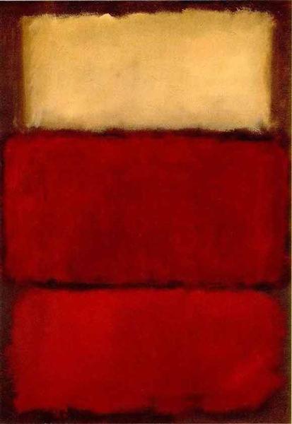
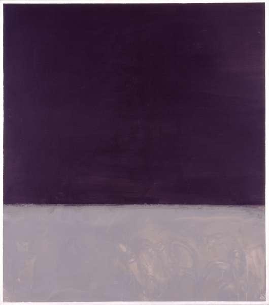
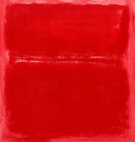
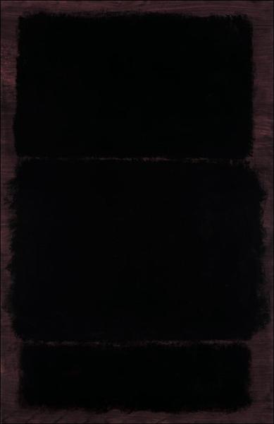
The large expanses of color in this work are immediately striking, imbued with a deep intensity through their dark shades. Created in 1969, this piece, rendered in oil on paper, leans into the minimalist movement with its stark, compelling forms. One can almost feel the weight of these visual fields, where the application of oil on paper might lend a particular texture and immediacy that differs from canvas. It makes you wonder how the paper itself interacts with the heavy pigments, perhaps absorbing them in a way that deepens the shadows or softens the edges. This "Untitled" work, typical of Mark Rothko's style as seen in other pieces from the period, creates a space that feels both vast and contained, pushing the boundaries of how color and form can evoke profound experiences. The choice of paper, rather than traditional canvas, suggests an intimacy with the material, allowing the dark shades to perhaps penetrate and stain the surface, rather than merely rest upon it. The overall effect leaves one contemplating the quiet power held within such vast, yet precisely delineated, fields of color.
No thoughts yet. Be the first to share one.
TagsMinimalismoilpaperabstract
5.00 (1 rating)
oil, paper · 1969
Medium
oil, paper
Period
Minimalism
Held at
San Francisco Museum of Modern Art (SFMOMA), San Francisco, CA, US