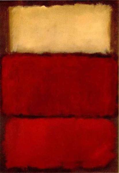
Red
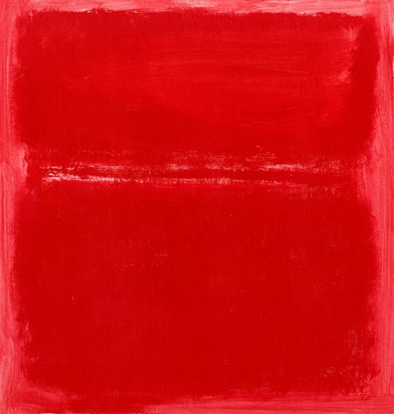
Mark Rothko, 1964
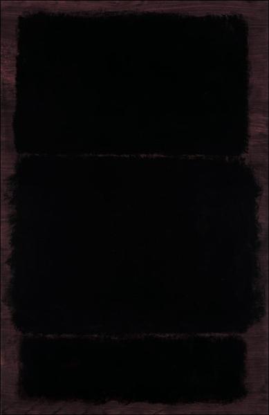
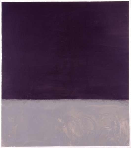
The profound stillness one imagines emanating from Mark Rothko's "Red" from 1964 immediately pulls you in, despite the limited details available about this specific work. Given his practice within the Color Field Painting movement, one anticipates vibrant, pulsating fields of color. The very title, "Red," suggests a singular, dominant hue, likely presented in the large, stacked rectangular forms that characterized his output around this period. These forms often appear to float, with blurred edges, creating an optical sensation of depth rather than flat surface. We know Rothko meticulously prepared his canvases; a piece like "No. 13 (White, Red on Yellow)" from 1958, for instance, employed oil and acrylic with powdered pigments on canvas, achieving a distinct material intensity. While the exact medium for the 1964 "Red" remains unrecorded in the available sources, one might speculate it shares a similar, deeply absorbed texture. The mystery of its specific visual composition, combined with the evocative power of the color red, leaves a lasting impression. What emotional resonance does a field of pure red carry when its precise visual details are left to the imagination, yet anchored by an artist renowned for profound chromatic explorations?
No thoughts yet. Be the first to share one.
TagsColor Field Paintingabstract
5.00 (1 rating)
1964
Period
Color Field Painting